Top App Retention Strategy to Master from Day 1
Ask any mobile app marketing expert: What’s an app’s most important—and trickiest—metric to master for app success?
The answer you’ll get (almost) every time: App Retention.
But here’s the harsh reality:
The average app loses nearly 75% of users within the 1st day of the app install. Looking at it from the flip side, average D1 app retention rates reach only about 25%—meaning that only 25% of unique users come back on the next day of opening the app.
As we move along the app retention rate spectrum, it gets even more challenging. By Day 7, app retention rate numbers fall to a scant 9%. By Day 30, to a measly 4%.
No matter how you slice it, the outlook looks grim.

It’s clear that the first days are critical to an app’s success. While there are many common strategies for increasing retention, here we’ll zero in on the best app retention strategy you must master from the very beginning to help reduce your app churn rate. Spoiler alert: it’s the app user onboarding process.
Before we dive into app user onboarding best practices with some helpful use cases and examples, let’s cover some of the basics first…
The role of the user onboarding process
When determining the best app marketing strategies, we app marketers look at everything in terms of where the user is in the app journey—or their Lifecycle Marketing stage.

If a new user has downloaded your app, that means you’ve successfully led the user from the acquisition stage to the activation (or onboarding) stage. Through your diligent ASO strategy efforts—your app store description, screenshots, reviews, etc—the acquired user should have a solid idea of what to expect from your app product.
But, just because they’ve moved along to the activation stage, that doesn’t mean that your work is done. Far from it—remember those stats we mentioned above?
Now, imagine you’re the newly acquired user and picture the following:
I just downloaded this app I’m really excited about, and I’m opening it for the first time. Is my excitement/need for this app reconfirmed upon opening? Do I have a clear sense of what this app will do for me and what I need to do next? Are there more complex features that I should be familiar with in order to truly benefit from this install?
If there’s any doubt about these user-facing issues, then you know your app needs an onboarding UX overhaul. Without it, you’ll end up with a frustrated user and an uptick in your app churn rate.
So the role of an optimized user onboarding experience is to effectively guide a new user from the activation stage and seamlessly into the app retention stage.
Ok, so how do you do that?
The features of a retention-boosting app onboarding UX
To avoid the dreaded “app-churn-at-first-open” scenario, you want to optimize the app onboarding experience so that it’s neither overwhelming nor insufficient—but make it so it’s just right.
It’s important to note that there is no one-size-fits-all rule when it comes to the best app user onboarding strategy. How lengthy you make the onboarding process will have a lot to do with the type of app you have. The key is presenting it in the right way so as not to confuse or frustrate your user.
With that in mind, let’s look at the onboarding UX features that yield the best retention rates:
Concise, focused initial walk-through or tutorial
We’ll be using the popular meditation app, Ten Percent Happier, as an example for the next couple of points.
The first thing they do right is immediately affirm the new user’s what and why of their app install decision with this simple, to-the-point first screen:

Next, the user embarks on an introductory journey that involves a series of questions. There are actually 15 total screens to get through. Usually, this is overkill, as scrolling through that many screens seems like a big ask. But let’s take a look at the strategy behind it.
For reference, here is a look at the first four onboarding screens or questions:
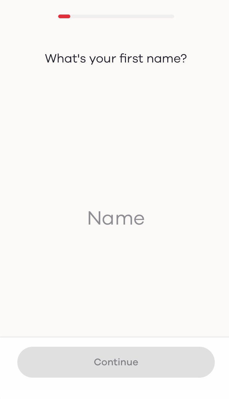
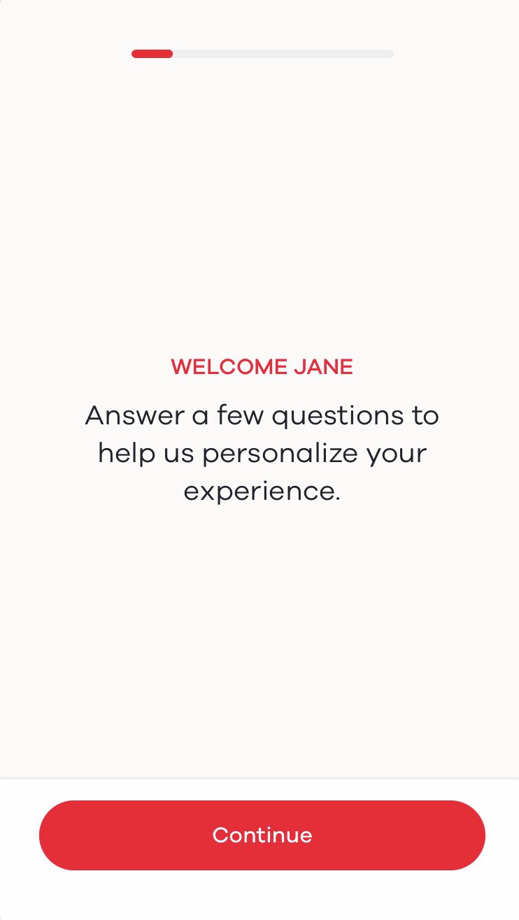
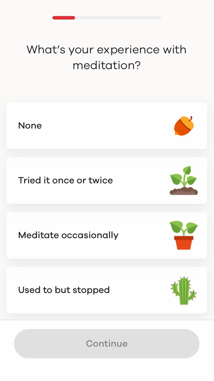
There are a few points about how Ten Percent Happier has structured the long series of questions that actually works in their favor:
- Each screen focuses on one, easy-to-answer question that’s painless to get through
- A clean design and simple visuals make for an aesthetically pleasant experience
- They clearly explain early on why they’re asking the questions from the user benefit perspective (“to help us personalize your experience) and remind them again about halfway through (at screen #6) what benefit the user will receive from this line of questioning—a benefit that is itself personalized based on your previous responses:

Minimal personal data requirements for registration or a “delayed ask”
People don’t want to give away too much personal information. As private beings, humans tend to be scared off by technology when they’re asked to divulge too many personal details, especially if they don’t know why or how this information will be used.
Again, Ten Percent Happier does an excellent job recognizing this skepticism and using a kid-glove approach. They start the onboarding by asking a series of questions—none of which involve disclosing personal data—with the why behind them.
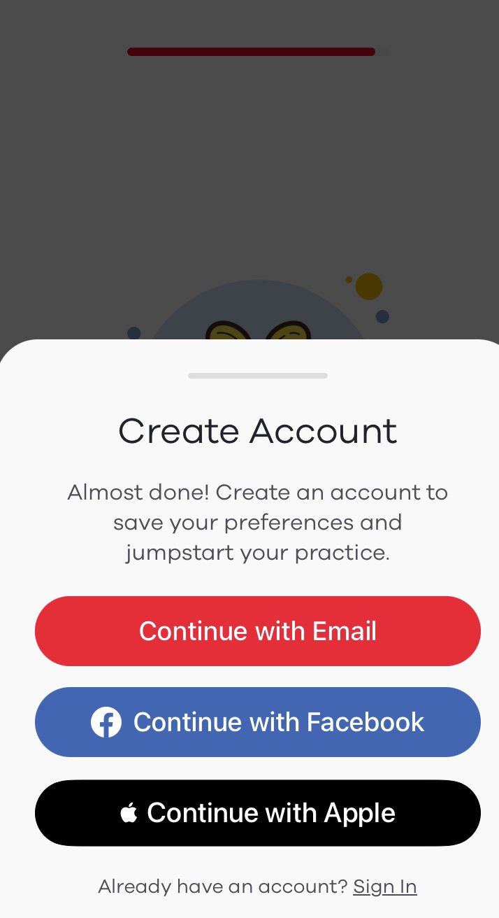
After answering all of the questions, they come to a “celebration” screen with an invitation to “see my plan.” By going through the personalization interrogation session, the user is already vested. Only after they’ve intrigued the user enough to want to see their personalized plan are they asked to create an account. By this point, the new user knows exactly how their personal info—whether they choose email or another sign-up method—will be used and why.

On-the-go user guidance with timely visual tips
Visual tips are useful for apps that feature many interactive elements or have an untraditional navigation method, as they will help new users understand how to interact with the interface. But you don’t want to bombard them upfront with visual tips, otherwise, you risk taking the user into cognitive overload. This doesn’t usually end well!
Instead, save such visual tips for when they’re needed. Providing the information in context is the best way to help the user make sense of it and ensure a more seamless and personalized user experience.
User-guided interactive tours can also be very effective. This means having a quick app tutorial activated only when the user reaches a certain point in their journey. It’s a learn-as-you-go approach that’s known to be an effective learning technique.
App onboarding & retention best practices for gaming apps
The onboard UX tips apply to most apps across categories. Here we’d like to highlight gaming apps as they’re the most popular app category in both iOS and Android.
As an example, we’ll use Gobsmax, a popular hyper-casual gaming app. They had a specific—though not uncommon—problem. They actually saw great Day 7 and Day 30 retention rates, but the issue was getting most users to that point. They were in fact losing a large chunk on Day 1.
As our client, we recommended that Gobsmax implement the following best practices:
- Reducing the number of taps (or screens) needed to reach the first action of the game
- Teaching the user new game mechanics at the relevant time—not all upfront
- Uninterrupted game play—especially at the beginning
- Introducing achievements and planting the seed of gamification benefits
The result?
A 40% increase in Day 1 retention rate!
The tricky part about increasing app retention is that no one solution is guaranteed to be the golden ticket to app success. But, there are app engagement best practices and proven app onboarding strategies that will certainly increase your chances.
Need help growing your app with customized marketing solutions—anywhere from user acquisition and ASO strategies to engagement and retention tactics and beyond? Book a free consultation with one of our experts!


