48 best user onboarding experiences (plus a free checklist to boost your SaaS)

48 best user onboarding experiences (plus a free checklist to boost your SaaS)

This lead image sets the stage for the article's exploration of top-tier user onboarding experiences and resources.
In reality, poor onboarding is the main reason users churn. However, the best user onboarding experiences know how to overcome that challenge! Want to do the same? Get started with our free user onboarding checklist designed to drive product adoption.
In this article, let’s review why onboarding is so important, and detail 8 great onboarding UX patterns with 48 top examples from SaaS apps.
- What is user onboarding?
- Why you should focus on onboarding
- Lesson 101: the basics behind the best user onboarding experiences
- How do you design a great onboarding experience? Top tips to learn from
- 8 great user onboarding UX and UI patterns from leading SaaS companies (With 48 examples!)
- #1 Leverage social proof using data, testimonials, and conversion rates
- #2 Email verification walls are conversion killers
- #3 Unnecessary steps discourage users from completing onboarding
- #4 Product tours should be action-focused, not informational
- #5 Segmenting users increases their likelihood to finish onboarding with success
- #6 Make onboarding motivating by emphasizing “what”, not “why”
- #7 Show helpful empty states that facilitate further user engagement
- #8 Behavior-based emails encourage new users to re-enter the product
- What are the key elements that define an excellent onboarding experience?
- Best user onboarding experiences - FAQ
What is user onboarding?
Onboarding is the process of getting users acquainted with your product and leading them to value as fast as possible! Indeed, that first impression is a crucial stage in all the best user onboarding experiences! Essentially, onboarding is where the user learns the ins and outs of your product. This can happen either manually or automated.
👉 Download our Free User Onboarding Checklist here!
Why you should focus on onboarding
The best user onboarding experiences lead to increased retention. For the average SaaS startup, it takes users 11 whole months to return their acquisition cost. That’s nearly a year before you see any profit! Losing a customer due to not conveying value clearly is a big bummer.
In reality, poor onboarding is the main reason users churn. However, the best user onboarding experiences know how to overcome that challenge! Want to do the same? Get started with our free user onboarding checklist designed to drive product adoption.
In this article, let’s review why onboarding is so important, and detail 8 great onboarding UX patterns with 48 top examples from SaaS apps.
- What is user onboarding?
- Why you should focus on onboarding
- Lesson 101: the basics behind the best user onboarding experiences
- How do you design a great onboarding experience? Top tips to learn from
- 8 great user onboarding UX and UI patterns from leading SaaS companies (With 48 examples!)
- #1 Leverage social proof using data, testimonials, and conversion rates
- #2 Email verification walls are conversion killers
- #3 Unnecessary steps discourage users from completing onboarding
- #4 Product tours should be action-focused, not informational
- #5 Segmenting users increases their likelihood to finish onboarding with success
- #6 Make onboarding motivating by emphasizing “what”, not “why”
- #7 Show helpful empty states that facilitate further user engagement
- #8 Behavior-based emails encourage new users to re-enter the product
- What are the key elements that define an excellent onboarding experience?
- Best user onboarding experiences – FAQ
What is user onboarding?
Onboarding is the process of getting users acquainted with your product and leading them to value as fast as possible! Indeed, that first impression is a crucial stage in all the best user onboarding experiences! Essentially, onboarding is where the user learns the ins and outs of your product. This can happen either manually or automated.
👉 Download our Free User Onboarding Checklist here!
Why you should focus on onboarding
The best user onboarding experiences lead to increased retention. For the average SaaS startup, it takes users 11 whole months to return their acquisition cost. That’s nearly a year before you see any profit! Losing a customer due to not conveying value clearly is a big bummer.
Lesson 101: the basics behind the best user onboarding experiences
These 3 things need to be on your user onboarding checklist:
- Useful - Do users get value from the experience?
- Easy to use - Can users get to value intuitively?
- Fun - Do users enjoy engaging in the experience?
But this is merely the background to the ultimate goal of onboarding: to acquaint users with your value! A shorter time to value will also help users reach the AHA moment faster, an important stage in user activation.
How do you design a great onboarding experience? Top tips to learn from.
To discover what constitutes the best user onboarding experiences, learn from the ones already out there! For example, how did French fintech Shine achieve an amazing 80% onboarding conversion rate? These are some tips from growth engineer Arnaud Babol:
Arnaud Babol - "Keep it simple: one screen, one action."
New customers can very easily be overloaded by your user interface. Therefore, it’s wise to segment each action with different screens. This makes it especially clear what you’re asking for!

Shine's onboarding flow exemplifies the 'one screen, one action' principle, breaking down the process into simple, manageable steps.
Arnaud Babol - "Make your onboarding experience unique with motion design."
Arnaud Babol writes that the best user onboarding experiences quickly cement their brand identity in the user’s head. One way to do that is with a unique motion design.
Arnaud Babol - "Never leave your user alone."
If your user is lost, that’s a missed opportunity! Instead, guide them with tooltips and checklists that lead them to their next action so they can still discover your true value.

Here, tooltips in Shine's UI guide the user, ensuring they are never left without direction during the onboarding process.
8 great user onboarding UX and UI patterns from leading SaaS companies (With 48 examples!)
#1 Leverage social proof using data, testimonials, and conversion rates
In times of uncertainty, we always look to take guidance from others. Behavioral scientists call this ‘social proof’ - and the best user onboarding experiences leverage it to powerful effect!
Insight Timer creates a global sense of community through social proof
To make users feel a part of a community, the wellness app Insight Timer shows on its dashboard how many users are meditating at that very moment. Not only does this validate the platform’s quality, but it also makes users feel they belong to a community!
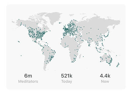
Insight Timer's live map demonstrates social proof by showing a global community of users meditating simultaneously, which enhances the sense of belonging.
How Kajabi uses longevity to position as an authority
Touting how long you have been in business hints at a history of success. For example, online course creator Kajabi boasts in a bold blue “10+ years as the industry leader”. It makes them stand out as authority figures in their industry.
Proof leverages expert testimonials to build brand trust
In a way, experts are influencers. Their clout can be used to give your brand credibility, and it is a particularly powerful influence. Personalization tool Proof has perhaps the best example - with a quote from Steve Jobs talking about how “personalization works”. Of course from him, that builds trust!
PiggyVest elevates brand champions
Easily accessible on their website, Nigerian fintech PiggyVest shares the story of hundreds of their ‘happy savers’. To be sure, the feature inspires success! In 2021, PiggyVest saved users over $585 million!

PiggyVest showcases success stories from their users, inspiring confidence and demonstrating the tangible benefits of their fintech platform.
Use conversion data to boost your credibility like Proof
Proof found a way to instantly communicate their value offer of boosting your conversions. How did they do it? Easy, with a counter on their landing page that says:
"1594 people requested a demo in the last 30 days."
Boast.io uses testimonials for proof-based marketing
Many users identified in the product adoption curve are risk-averse. But when you post testimonials on your landing page, you help reduce your prospect’s fear of change by making the switch less intimidating. Boast.io is a video testimonial tool practicing what they preach!
Invision builds brand trust through recognizable logos
If a trusted company is your client, then customers will see you as trustworthy too! To benefit from that trust, follow the example of Invision and place the most recognizable logos of your business customers on your website. Research shows it can increase conversions by 400%!
ShipBob uses testimonials, reviews, and data to boost social proof!
This E-commerce platform guarantees success with multiple types of social proof. Besides a testimonial and a few world-class logos, it also features raw data such as:
- Trusted by 7000+ brands
- 99,96% of orders ship on time
- 99,95% accuracy rate
- 30+ fulfillment centers
- #1 fulfillment technology
👉 Download our Free User Onboarding Checklist here!
#2 Email verification walls are conversion killers
Email verification walls are common - but they’re also a big reason for churn. Make sure to take these insights with you on your user onboarding checklist!
Snappa delays verification requests to turn churn into growth
Graphic design tool Snappa discovered that 27% of all signups never activated their email. But when Snappa removed the request, monthly revenue quickly rose by 20%!

This graph illustrates the significant revenue growth Snappa experienced after removing the email verification wall, a key lesson in reducing user friction.
Ensure email deliverability in-app like Monday.com
Of course, you want the user’s email, but you also want them to stay in-app, or else they might churn. Solve this problem like work management software Monday! Monday lets users experience the value straight away and only alerts users if their email bounces.
Simply don’t ask for registration like Jotform
Incredibly, form builder Jotform doesn’t ask new users to register. In fact, they allow customers to test the app’s full functionality! Actually, users only need to register when they wish to send out forms. This method must work to increase product adoption - in 2022 Jotform achieved 1 billion form submissions!
👉 Download our Free User Onboarding Checklist here!
#3 Unnecessary steps discourage users from completing onboarding
Industry wisdom states that each onboarding step results in a 20% increase in user churn – so keep it short and sweet!
Behavioral scientists will tell you that unnecessary steps and choices can accumulate to a dangerous degree. In detail, there are 2 major effects that you want to avoid triggering:
The paradox of Choice. The more choices you give a user, the less likely they are to choose!
Hick's Law. Basically, where decision time increases with every additional choice.
Don’t waste time stating the obvious. In fact, studies show that the optimal onboarding length is 3 screens! With extra steps, conversions can fall from 72% to as low as 45%.
Shopify split onboarding on multiple screens
If you still need more information to make your product valuable, then look at Shopify! The first page focuses on your use case for the platform. Then, you complete your personal details and get started!
WaveHQ does the styling for you
Instead of letting you customize your workspace to your own brand Wave simply asks you to add your logo and does the rest for you. Some might think this is still an extra step, however, it seems to fuel motivation and user engagement.
Zakeke uses hotspots to avoid information overload
First, ask yourself what is necessary for onboarding. Then ask “when is it necessary?” Hotspots like Zakeke guide the user in real-time. As a result, they eliminate the need for extra steps and thus user churn.
Zakeke uses hotspot tooltips to provide contextual information just-in-time, preventing information overload and keeping the onboarding flow clean.
Let users skip profile set-up like Substack
Should new users need to set up their profile photo and bio, before they have even trialed the product? Well, that used to be how it was for Substack. Today, however, Substack lets users “skip for now” - removing a big barrier to initial user engagement.
Avo keeps a quick and clean UI with a singular focus
Analytics tool Avo keeps each onboarding screen as simple as possible, asking questions like “what are the sources of your data?”, alongside clear, clickable options that move users on to the next stage in their journey.
Avo's onboarding screen maintains a singular focus, asking a clear question with simple options to guide the user smoothly through setup.
Speed up time to value with suggestions like Reclaim
Time blocking tool Reclaim for instance asks during onboarding if you want to block out time for lunch. Not only does this immediately display their unique value, but it also introduces users to a new way of planning!
#4 Product tours should be action-focused, not informational
In reality, we as humans are overloaded with information every day. And often, we don’t know what to do with any of it! To avoid this, create an action-focused UX. In essence, if users start with action in their minds, they are more likely to take the next steps!
For example, a gamified user onboarding checklist states the next steps to take along with potential rewards.
Mint has a clear CTA on each screen to prompt user engagement
Mint’s headline is a rousing CTA: “See all your money in one number”.

Mint's onboarding screen features a powerful and direct call-to-action, encouraging users to engage immediately by seeing all their finances in one place.
Gamified checklists motivate users to finish onboarding on Quora
A gamified user onboarding checklist provokes the ‘endowed progress effect’. This principle notes that people are more likely to finish something if they think they are close to completion. To lock in this effect, reward users for completing ‘dummy’ tasks like ‘signed up’. Quora users already have 1-3 out of their items crossed after signing up.
How to increase product adoption with a gamified product? Get your expert-led workshop & learn how to use behavioral psychology to your advantage!
Improve product discovery with interactive paths like Xero
When customers sign up to Xero to improve their accounting, their greatest dread is probably a wall of confusing numbers! But the Xero dashboard is like a simple choose-your-own-adventure game.
Not only is this fun to use, but Xero’s UX empowers users with the choice of product tour, letting them discover what is most valuable to them faster!

Xero's interactive, 'choose-your-own-adventure' product tour empowers users to discover the features most relevant to their needs first.
Why Xero frames tasks as win-based actions
Framing tasks as a win will remind users of why they’re completing the product tour. Take Xero again. For each task on their product tour, win-based copy triggers users to action: “Get paid faster”, “Track your money”, and “Stay on top of your taxes”.
Hypercontext uses modals to highlight the key tasks
Hypercontext is a collaborative meeting SaaS that promises to make meetings more productive. To convey this value quickly, modals highlight the app’s key tasks: “Create your first agenda”.

Hypercontext effectively uses a modal window to highlight the primary action, "Create your first agenda," guiding new users towards their 'Aha!' moment.
How Headspace fuels healthy habits with streaks and badges
Wellness app Headspace has 2,100 corporate customers - and they manage this because their app encourages habit formation. With gamified streaks and badges that celebrate early successes, users are intrinsically motivated to use the platform and earn more.
👉 Download our Free User Onboarding Checklist here!
#5 Segmenting users increases their likelihood to finish onboarding with success
When you segment users, you understand their needs on a deeper level. This knowledge can be used to personalize onboarding and create more value!
Customize product samples like Genially
Genially is an animated content platform to create infographics, presentations, and e-learning materials. During onboarding Genially asks a few questions like what industry you work in. Then, they display a customized design sample based on your preferences.
Lumen5 motivates users with custom goals
Letting users set their own goals should be on your user onboarding checklist. For users, it provides a clear purpose. For you, it allows you to personalize the user experience! Video maker Lumen5 wastes no time in doing this. In fact, they devote their second onboarding screen to asking new users about their goals.

During onboarding, Lumen5 asks users to define their goals, which allows for a personalized experience and provides a clear purpose from the start.
Ticketmaster uses geolocation to customize your feed
For many apps, what you offer varies wildly depending on where the user lives. For Ticketmaster, geolocation data is crucial to personalizing offers like upcoming concerts that might interest the user. Equally, to discover what a user likes, onboarding fields that simply ask users their favorite artists are a great way to personalize offers.
Segment users on NPS score like Qualtrics
Not all users want the same. So why not segment them based on customer satisfaction? One way to do so is through a Net Promoter Survey such as Qualtrics. Besides defining the key drivers for different segments, you’ll also learn where to prioritize support!
Evernote enhances personalization during onboarding
When starting off with Evernote you’ll be asked to order your main use cases for the product. As a result, you’ll get a customized template library and interface to start. This way you get a product experience relevant to you.
Dropbox targets account expansion through segmentation
Dropbox doesn’t try to sell its premium product to barely engaged users. Instead, they segment the most engaged users expected to reach their storage limit. What’s that saying about marketing again? Right place, right time?
👉 Download our Free User Onboarding Checklist here!
#6 Make onboarding motivating by emphasizing “what”, not just “why”
Simplicity is key. That’s why focusing on the concrete ‘what’ instead of a more abstract ‘why’. There is a famous quote that should sum up your attitude towards user experiences:
“A designer knows they have achieved perfection not when there is nothing left to add, but when there is nothing left to take away.”
Calendly uses copy that gets straight to the point
Essentially, your copy should stick to the task at hand! Otherwise, you run the risk of being ignored. Calendly avoids this with a simple headline based on ‘what’ they offer.
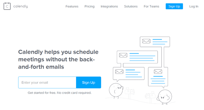
Calendly's landing page copy is a prime example of simplicity, getting straight to the point to communicate the product's core value instantly.
Sprig emphasizes feature benefits to increase feature adoption
User research tool Sprig is clear on its benefits as users create a survey - and that’s good! Alongside a preview of the final result, a text bubble reads “we’ll automatically customize your company name to increase response rates”.
Let users complete micro-commitments like Grammarly
Handing new users small tasks is a fast way to get them invested and learn why your product is great. Moreover, users will feel like they earn their reward! For instance, Grammarly asks demo users to correct problems in a sample document. As a result, it instantly conveys the core value of their product.
Togglr uses gamified rewards to reinforce user action
Gamified rewards provide users with an intrinsic satisfaction that facilitates repeated user engagement. For example, when Togglr users successfully complete a task for the first time, the app celebrates their success with a clapping emoji. This positive reinforcement gives users a reason ‘why’ they should complete the task again!

Toggl demonstrates positive reinforcement by using a simple clapping emoji to celebrate a user's first completed task, encouraging repeat engagement.
Sprout explains what they’ll do with your data (and why they need it!)
For many apps, onboarding means asking users for access to their personal data. That can be a thorny subject - so it pays to tell users exactly why users should accept:
Sprout Social - "It’s okay to click ‘Okay’! We need your permission to deliver and report on the messages you post."
Moosend’s progress bars remind users of their goal (and how far they’ve come)
Aside from showing users their past personal progress, progress bars remind users of their goals. Email marketing software Moosend has a great gamified progress bar that fills after each onboarding step, culminating in the ultimate goal: “send a campaign”.
Drive product-led growth with an in-app gamified experience! Simply link to our modular gamification software & start testing!
#7 Show helpful empty states that facilitate further user engagement
While only an estimated 5% of users ever see an empty state, they’re still a great opportunity to drive user engagement. How? By balancing the principles of all the best user onboarding experiences that include education, motivation, and direction.
Todoist makes empty states the end goal
We all love the feeling of completing our to-do list. So what better example than Todoist using empty states to celebrate user success? In addition, they prompt users to share their success with a hashtag and social media buttons.
Todoist - "Enjoy your afternoon. Today you completed 8 tasks and reached #TodoistZero!"
Buffer gets you connected with 1 click
Buffer is a social media publishing and analytics tool, so it doesn’t have much value without linking your channels. That’s why their empty states suggest “connect your first channel”.
How Superhuman charms users with feel-good nature scenes
Believe it or not, empty states can actually make users more productive! This effect is called ‘biophilia’ and has even been shown to improve moods. Taking advantage of this, email SaaS Superhuman shows users landscapes when they reach inbox zero!

Superhuman uses beautiful, serene landscapes as a reward for reaching 'inbox zero,' leveraging biophilia to create a positive and calming user experience.
Guide users to their next step like Jobpal
Jobpal is an automated recruitment solution that saves both recruiters and candidates a ton of time. As a recruiter, the empty state makes it very clear which next steps to take. This way you never get stuck, or bored with endless onboarding tours!
Jobpal's empty state clearly outlines the next steps a recruiter should take, preventing confusion and guiding them towards productive use of the platform.
Use empty states to inspire users like Notion
When you create a new page on Notion its default state is empty. However, Notion adds demo content which is also educational and instructive. For instance, they include a get started checklist explaining their features and the copy: “Press enter to continue with an empty page or pick a template.”.
Copper turns empty completion pages into conversion machines
Onboarding should be more than creating a personal profile. Follow the lead of CRM app Copper, which promotes their Chrome extension. As a result, 25% of new users install their Chrome extension directly from this screen!

After profile completion, Copper uses this success state to promote its Chrome extension, successfully converting a significant percentage of new users.
Salesflare locks you in with a simple suggestion
When users hit an empty state on CRM tool Salesflare, the dashboard suggests that users automatically connect their email contacts. That’s instant value and makes churn less likely!
👉 Download our Free User Onboarding Checklist here!
#8 Behavior-based emails encourage new users to re-enter the product
Every user onboarding checklist should include behavioral emails or messaging. Not only does it improve user onboarding, but it also brings back potential drop-offs!
While most emails get put straight in spam, recipients are over 75% more likely to open welcome emails than other marketing emails. Take advantage of that open rate to drive the behavior that you know will lead to product adoption.
Kick-off onboarding with reaffirming CTA’s like Hotjar
The best user onboarding experiences make their emails action-focused. In other words, they clearly describe the benefits next to concrete action. Take Hotjar’s ‘get started’ email for instance!
Hotjar - "Ready to see what’s really stopping your visitors from converting? You’re only minutes away from seeing your site through your users eyes!"
Databox helps you become a data-driven professional
Don’t give up on users who are already halfway through the process! Databox for instance encourages you to complete the final step to becoming a data-driven professional. Strong copy like ‘What are you waiting for?!’ and ‘Complete stage 1’ skyrocket completion.
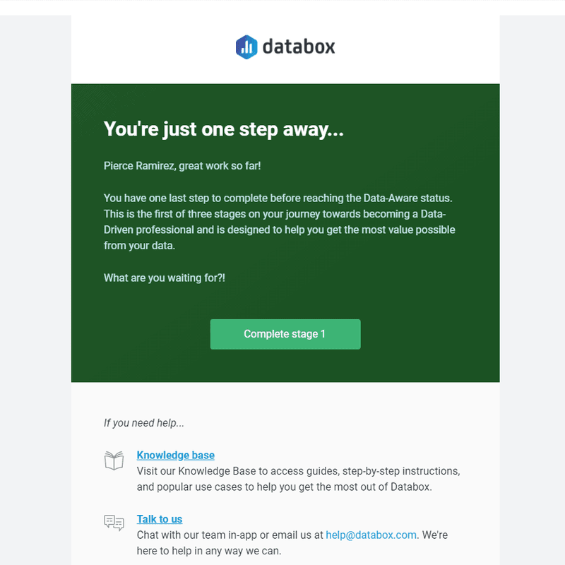
This behavioral email from Databox uses encouraging and urgent copy to re-engage users who are partway through the setup process.
Celebrate success and build upon it like Soapbox
Soapbox rewards users with a fun rockstar gif for uploading their first video - which already highlights the product’s value. Then, they encourage users to complete the next steps of editing or improving their video. Besides being helpful, it clearly demonstrates the product value at the right moment!
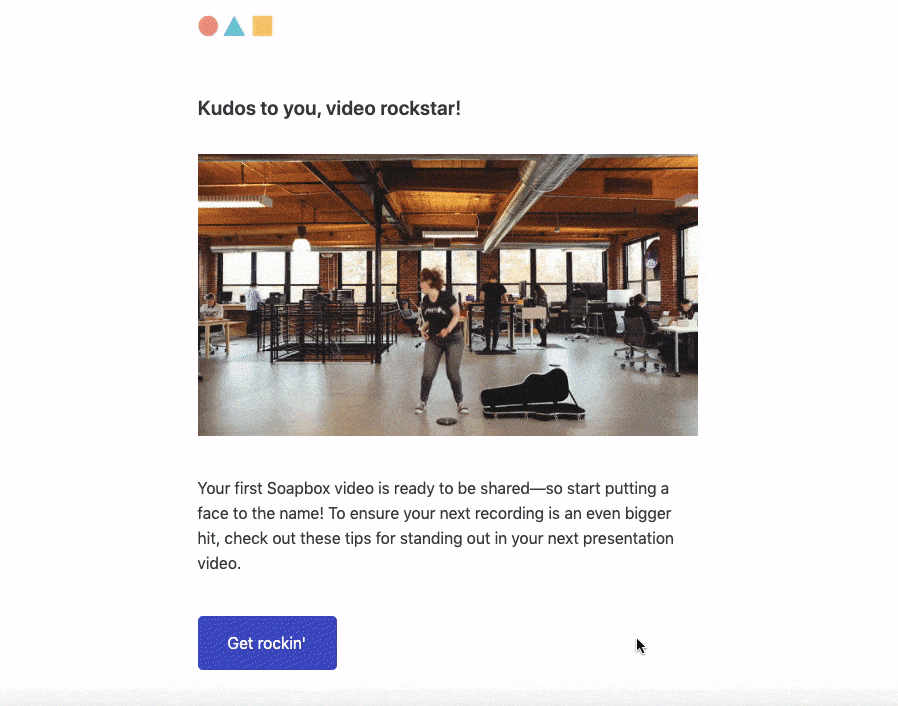
Soapbox celebrates a user's first video upload with a fun GIF and immediately suggests the next steps, building momentum and demonstrating further value.
Learn to drive user engagement like Asana
Asana has the mission of making its users more productive, so what better way to act on this than by sending an action-packed email? If you’re new to their product it might feel overwhelming. However, by giving clear step-by-step instructions Asana gets you started in no time!
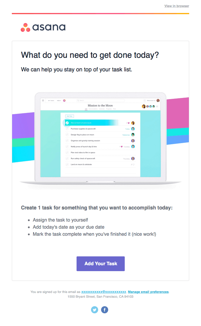
Asana's welcome email provides clear, step-by-step instructions to help new users overcome the initial learning curve and start organizing tasks effectively.
Monday’s custom tours designed to suit the user’s behavior
Everyone behaves differently - and that extends to the best user onboarding experiences. Look at workflow SaaS Monday for instance. Its welcome email empowers users with the choice of a video or text product tour. This extra autonomy makes users more likely to engage with their preferred style, leading to increased engagement and onboarding success!
Groove steps in before you can say churn 3 times!
Your user onboarding checklist should be as churn-proof as possible. Take productivity platform Groove, which intervened when users had issues setting up email forwarding. As a result of their supportive email, Groove achieved a 30% retention rate in just 30 days!

Groove's proactive support email intervenes at a common friction point, helping users set up email forwarding and drastically improving retention rates.
Keep users engaged with gamified performance reports like Grammarly
Nobody buys software. They buy outcomes! With this in mind, gamified reports can increase motivation enough to keep users going! Take Grammarly for example. In its weekly writing update, you can see your streak, activity-based achievements & how productive and unique you are compared to other Grammarly users.
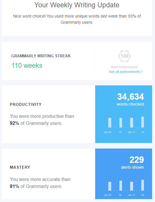
Grammarly's gamified weekly writing report keeps users engaged by showing their streaks, achievements, and comparisons with other users, reinforcing the value of the tool.
So.. What are the key elements that define an excellent onboarding experience?
We analyzed the 48 examples and made a practical checklist to follow. Download the free checklist here.
Best user onboarding experiences - FAQ
What is user onboarding?
Onboarding is the process of getting users acquainted with your product and leading them to value as fast as possible! Indeed, that first impression is a crucial stage in all the best user onboarding experiences! Essentially, onboarding is where the user learns the ins and outs of your product. This can happen either manually or automated.
Why should you focus on onboarding?
The best user onboarding experiences lead to increased retention. For the average SaaS startup, it takes users 11 whole months to return their acquisition cost. That’s nearly a year before you see any profit! Losing a customer due to not conveying value clearly is a big bummer.
What are the basics of great user onboarding?
Your user onboarding checklist should include 3 things: to make your product useful, as well as fun, and easy to use. But this is merely the background to the ultimate goal of onboarding: to acquaint users with your value!
What are the 4 steps of a SaaS user onboarding checklist?
Start off by inspiring action. Sometimes copywriting can be enough, however, in-app prompts can also help. Then, reward users for taking action to keep them coming back. Afterward, you can drive repeat usage with personalized messaging and gamification. Finally, expand usage through education and build power users!
Related Posts

68 successful gamification examples to unlock user engagement & loyalty
Looking to incorporate gamification into your strategy? Discover how successful companies are using gamification to increase their users' engagement & loyalty, and drive business growth. Explore 68 real-life gamification examples from various industries including fintech, education, e-commerce, mobility, and more. Don't miss out on this comprehensive guide to gamification!